How We Prevented Text from Shifting When Symbols Appear
Have you ever moved the cursor over a list item, only to see all the text shift sideways for a moment? It happens in almost every editor that hides and reveals symbols.

When I moved the caret to edit a list, the text shifted sideways. When the caret moved away, it shifted back.
Only one line moved, but it looked as though the entire paragraph was shaking. That small difference kept interrupting the flow of editing.
The cause was the width of the marker.
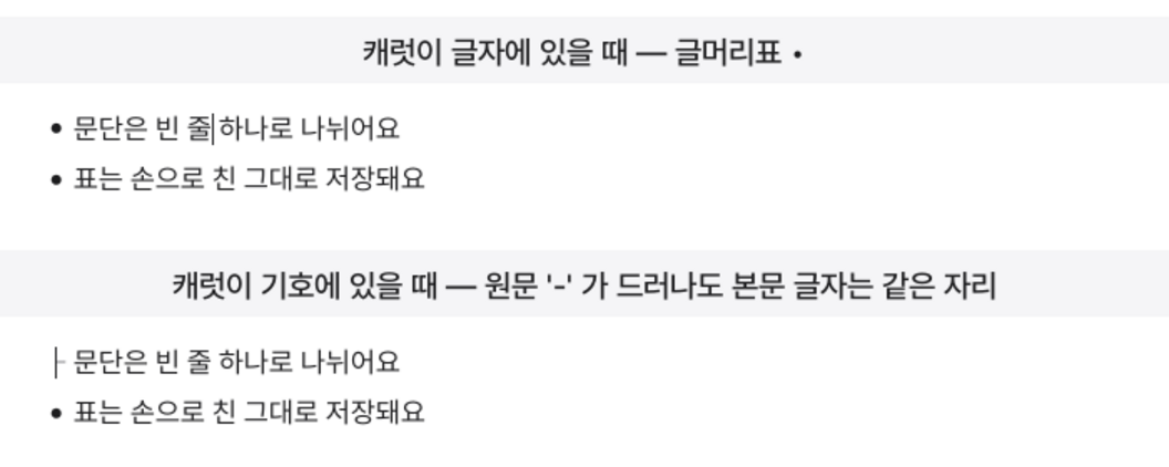
Normally, a round bullet appears on the screen. But the file stores a hyphen and a space. When the caret touches the marker, the original text has to be shown so that it can be edited directly.
The problem is that the two forms occupy different widths. A bullet sits in a box with a fixed width, but the width of a hyphen and a space varies depending on the font. In mote, the difference was 4.9 px. Every time the original text appeared, the text after it was pushed over by that amount.
Move the Line by the Difference in Width
I didn’t make the two widths identical. Instead, I offset the difference.
The moment the marker changes to its original text, the entire line moves in the opposite direction by the difference in width. The shape of the symbol changes, but the body text still begins in the same place.
The file is left untouched. The bullet is a decoration drawn over the hyphen, and the adjustment only changes where the line is drawn on the screen. The stored content remains the same whether the caret enters or leaves.
I also unified the basis used to calculate the width. Previously, separate numbers were used where the marker was drawn and where the line was adjusted. The small difference between those two values was exactly that 4.9 px.
Now both places ask the same function for the marker’s width. With a single reference point, they can no longer fall out of alignment.
However, the adjustment is not applied when there is not enough space in the left margin. Otherwise, moving the line could cause the text to be clipped outside the window. Disappearing text is a bigger problem than shaking text.
I Let Headings and Quotes Shift
At first, I applied the same approach to headings and quotes.
But the heading’s # and the quote’s > normally occupy zero width on the screen. To keep the body text fixed, the symbols had to be pushed into the left margin.
Technically, it worked well. The text did not move. But the screen looked unfamiliar. Having the symbols float separately in the margin did not look natural.
So I reverted it. Now, when heading and quote symbols appear, the body text shifts to the right.

In the end, I chose a different answer for each type of marker.
Markers that have a box on the screen, such as bullets and task checkboxes, keep the body text fixed. Markers that normally have zero width, such as headings and quotes, push the body text over.
A natural-looking screen mattered more than a single rule.
Show Symbols Only When They Are Needed
The best way to reduce shaking is to reduce the number of moments when symbols change in the first place.
Now, a bullet marker is shown as its original text only when the caret is over the symbol. As soon as the caret passes the space and moves into the body text, it turns back into a bullet. There is no need to keep seeing the hyphen while editing the contents of the list.
Alignment is preserved even when a long line wraps onto the next line. While the marker is shown as its original text, the second line still begins beneath the body text of the first line.
I also fixed an issue where clicks were mistakenly recognized as drags. When the pointer moved slightly at the moment the marker changed, text would sometimes be selected. Now the pointer must move more than 8 px before it is treated as a drag.
Verify with Numbers Instead of Your Eyes
Differences like these are hard to check by eye alone. They may look fine at a glance but feel distracting after prolonged use.
So I created a test that launches the actual app. It moves the caret in and out of the marker and directly compares the x-coordinate where the body text begins. The test passes only when the two values are equal.
Bullets, task checkboxes, and nested lists are all checked in the same way.
A one-pixel misalignment is unlikely to be reported as a bug. Instead of explaining what moved, users simply feel that “something is distracting.”
That is why movements like these should be watched by numbers, not people.
A quiet screen is not one where nothing happens. It is one where necessary changes happen without drawing attention to themselves.