FeaturesPricingDocsBlog
Get mote
← Blog
Engineering·July 2, 2026·5 min read

Why We Let the Platform Render Text Instead of Drawing It Ourselves

Have you ever noticed that Hangul looks fine, but only the Chinese characters look somehow unfamiliar? When we decide not to draw text ourselves and leave it to the platform’s text engine, our job becomes not “what to draw,” but “which font to ask for.”

m
mote
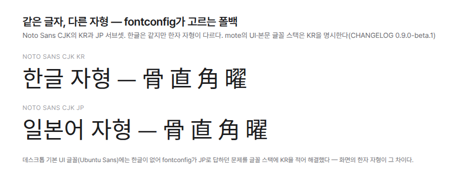
A comparison of the same string rendered with the KR and JP subsets of Noto Sans CJK. The Hangul is the same, but the glyph forms of Chinese characters such as 뼈 골 and 곧을 직 are different.

A lot has to happen before text appears on the screen. Characters have to be turned into shapes, lines have to be broken, and everything has to be drawn as pixels. Hangul composition, Chinese characters, emoji, Arabic script, and font fallback all have to be handled.

We did not build this process from scratch. We entrusted it to Pango and HarfBuzz on Linux, DirectWrite on Windows, and TextKit 2 on macOS.

That is because operating systems have refined this area for a long time. If we built it ourselves, there was a high chance that the quality would actually get worse in tricky areas such as CJK characters and accessibility. We also believed that the product’s differentiation lay not in the renderer itself, but in its typography and platform-native feel.

Instead, We Decided When to Create It

Text layouts take time and memory to create. Large documents can contain tens of thousands of lines, so we could not create all of them.

That is why we create only the lines visible on the screen and those around them. Lines that move far away from the screen are discarded immediately. Even after scrolling through a 1 MB document for a long time, only about forty to sixty layouts remain alive.

For lines that have not yet been created, we estimate their heights in advance. That is because the scrollbar needs to know the full length of the document.

Of course, the estimate can sometimes be wrong. If a newly calculated height differs from the estimate, the screen can shift. When that happens, we adjust the scroll position by the difference within the same frame. To the user’s eyes, nothing should appear to have happened.

A line in which Hangul is being composed is rendered without decoration. This is because if attributes such as bold or hidden text intervene during input, the number of characters known to the input method can differ from the number of characters on the screen.

The First Problem We Encountered Was the Face of Chinese Characters

When you leave things to the platform, you also inherit the platform’s defaults.

Ubuntu’s default UI font does not include Hangul. So the font the system chose instead was Noto Sans CJK JP. Hangul displayed properly, but some Chinese characters appeared in Japanese glyph forms. This is because some characters have different shapes in Korea and Japan even though they share the same Unicode code point.

The solution was simple. We placed Noto Sans CJK KR first in the UI font list.

But there was something else that mattered more. If we do not define the standard, the platform responds according to its own defaults rather than the user’s language.

We Create Language-Specific Shapes Through Font Order

A font stack searches for characters from the beginning. Only characters unavailable in the first font move on to the next one.

By taking advantage of this behavior, we can display Latin text in a serif font and Hangul in a sans-serif font. A single line of settings combines fonts suited to each language.

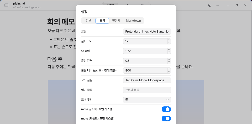
If the reading font is left empty, the body font is used as is. If it is specified separately, it changes only in reading mode. Source mode uses the code font.

The font size follows the operating system’s accessibility settings. Users who have enlarged text in the system do not have to configure it again in every app.

The Appearance tab of the settings card — the font field contains a comma-separated stack as is, while the reading font is empty and displays “Same as body” in faint text.

Screen readers use the same foundation. Because accessibility features are already connected to the platform’s text layer, we only need to provide the exact content of the requested line.

The Build Fails If a Translation Is Missing

UI strings are written in English, and those strings are used as keys in the translation table. If a translation is missing, the English appears on the screen as is.

The problem is that no error occurs. Even when a translation is missing, English quietly appears mixed in with the other language.

So we created a validation script. It collects the strings actually used in the code and compares them against the translation tables for 12 languages. If a string is added to only one language or a translation is omitted, the build fails.

Each translation table contains 304 keys, and 282 strings are actually used in the code. The supported languages are English, 한국어, 日本語, 简体中文, 繁體中文, Deutsch, Français, Español, Português (Brasil), Русский, Italiano, and Polski.

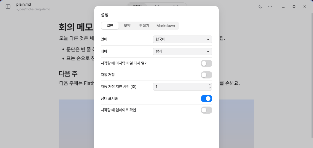
The General tab of the settings — the top row is the language dropdown, and Korean is selected, so all the item names below it are also in Korean.

When the language is changed, we open a new window with the same document and close the existing window. Translating hundreds of already visible widgets one by one creates a high risk of missing something. We decided that reopening the window once at the moment the language changes was safer than maintaining a complex path that is rarely used.

When You Leave It to the Platform, the Result Resembles the Platform Too

Even with the same document, the pixels are not completely identical across operating systems. This is because they use different methods of text smoothing and different default fonts.

We do not force them to look identical. Instead, we keep the document’s standards consistent, such as the relative font sizes, line height, and margins.

Fallback results can also vary depending on the installed fonts. So rather than promising a particular result, we transparently show the order in which fonts are requested. Users can also change it themselves.

Not drawing it ourselves does not make the responsibility disappear. We have to decide more precisely what to delegate and in what order to make requests.

← OlderWhy We Built Platform-Specific Shells Around a Single Rust CoreNewer →Why Typing Stays Fast Even as Documents Grow Longer
Follow along by RSS.
Nothing but writing.
English
© 2026 mote